THE HOME
DEPOT.
High-volume retail creative built for clarity, speed and scale. The work shown here focuses on digital flyers and supporting print executions for The Home Depot Canada—organizing dense product assortments, promotional offers and campaign messaging across bilingual and regional versions while protecting a consistent visual hierarchy.
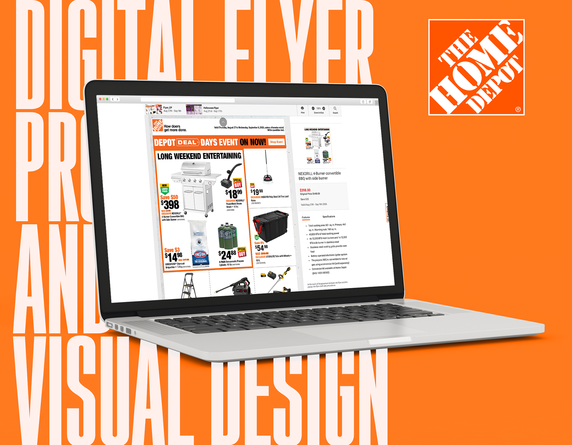
Retail design at scale.
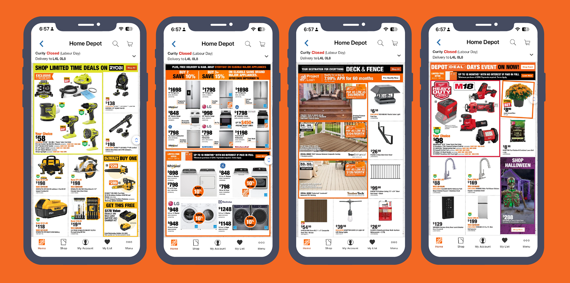
Digital flyer pages turn a large amount of pricing, product imagery, promotional mechanics and brand messaging into a fast, scannable customer experience. The system has to support very different categories—from tools and appliances to outdoor living and seasonal products—without losing hierarchy or consistency.
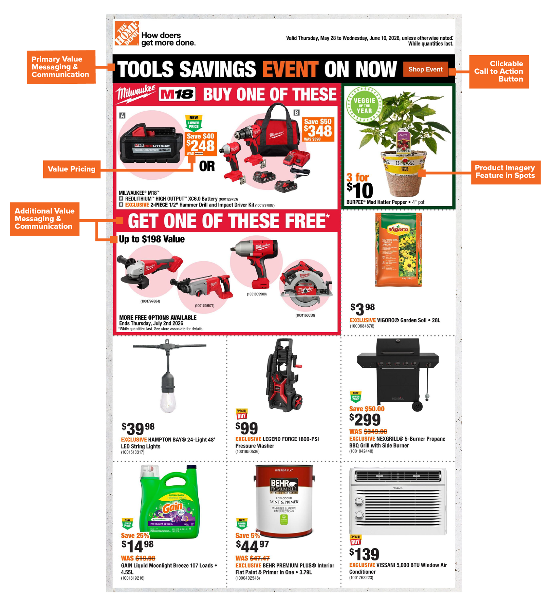
Make the offer obvious.
Strong retail creative is information design. Primary event messaging, value pricing, free-item offers, product imagery and calls to action all compete for attention. A clear hierarchy gives customers an immediate entry point, then lets them move naturally through the offer and supporting details.
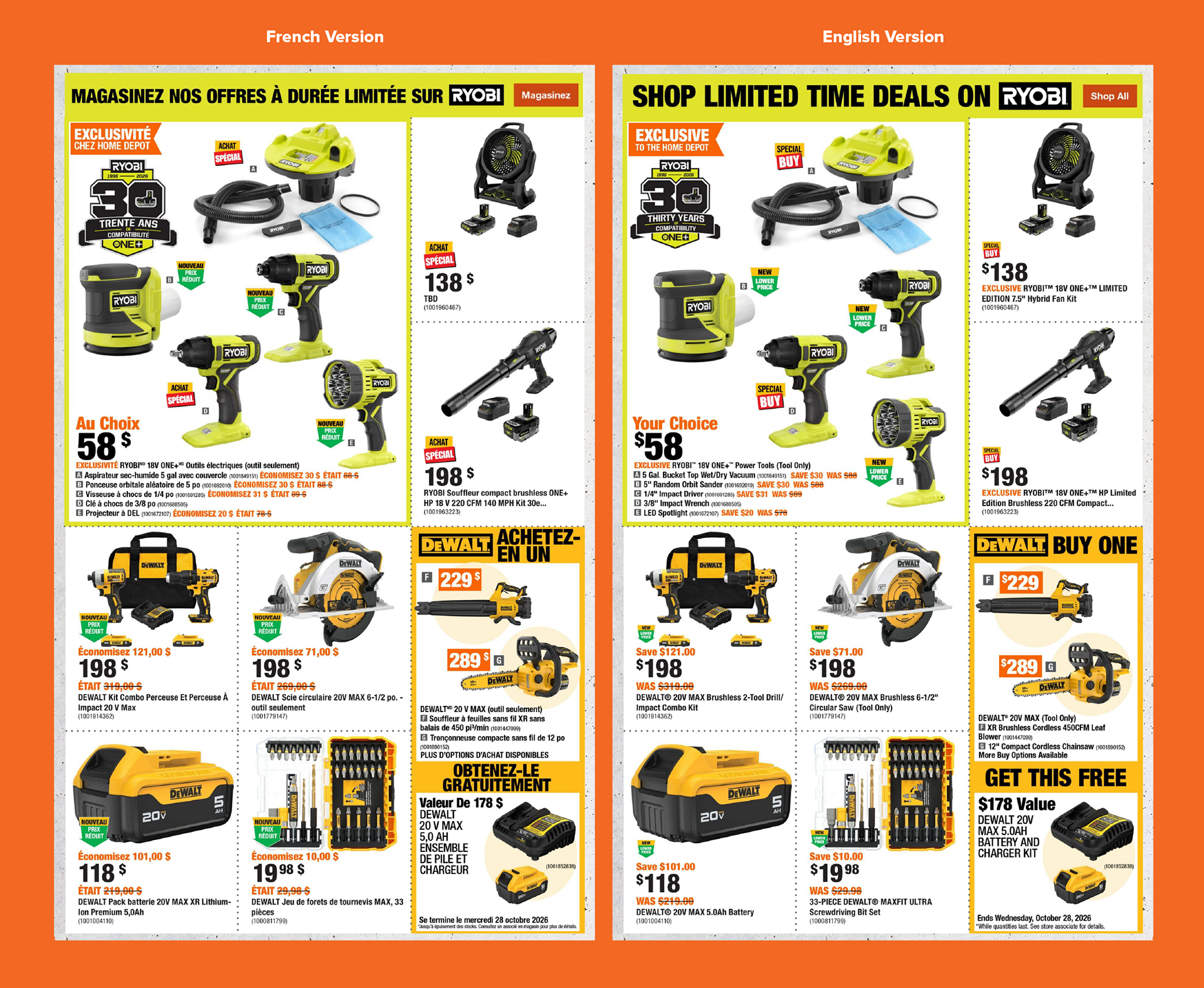
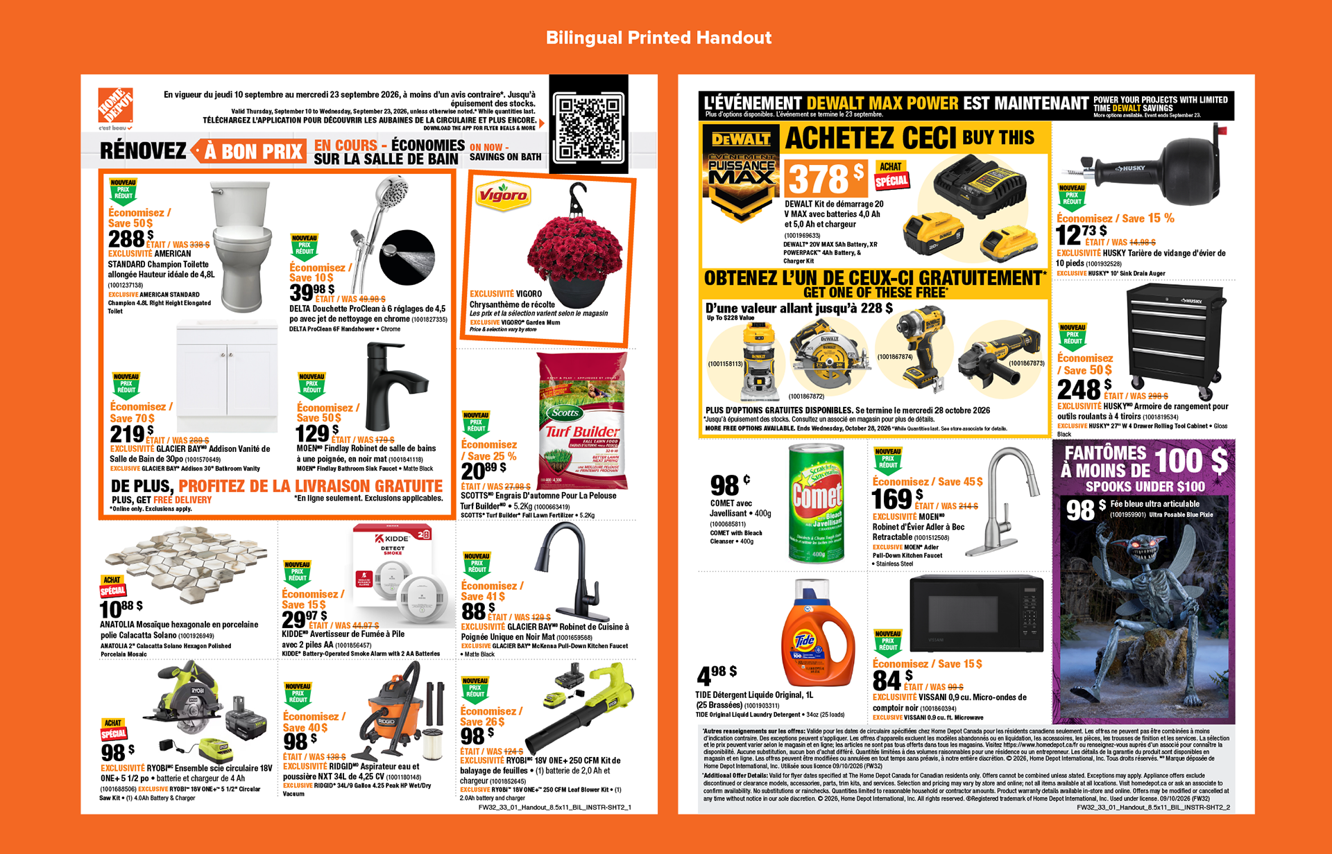
One campaign. Two languages.
Canadian retail campaigns require English and French executions that remain visually aligned even when copy length, pricing language and promotional terminology change. The goal is not simply translation—it is maintaining hierarchy, balance and usability across both versions.
Built for market differences.
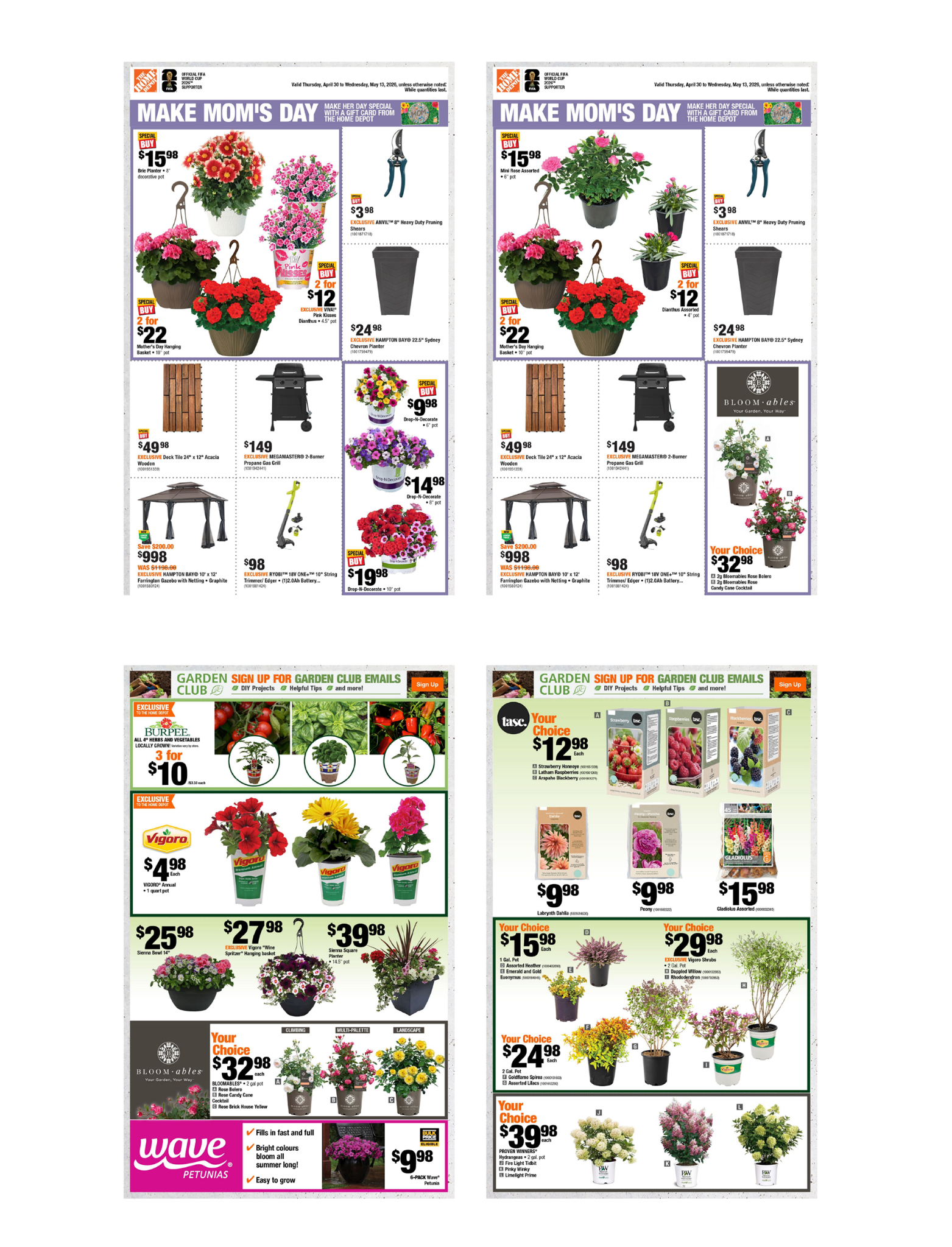
National retail creative also has to flex for regional assortment and market needs. These examples show how the same flyer framework can accommodate meaningful product differences between Ontario and Atlantic markets while keeping the overall campaign recognizable.
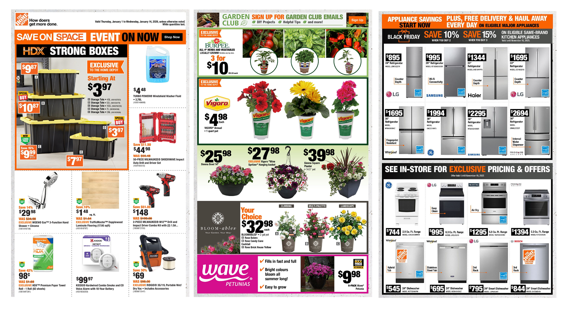
One system. Very different products.
The flyer framework needs enough discipline to feel unmistakably Home Depot and enough flexibility to merchandise storage, live goods, appliances, tools and seasonal categories effectively. Layout, typography, promotional devices and imagery work together to make dense pages easy to browse.